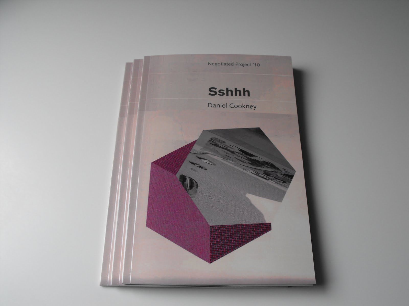
I've nearly finished the report for this project and for a while I have been talking about producing it in the format of a paperback book. So I just need to do a few more hours on it and then I can send it for printing. The above is the cover image which is based on the Marber Grid that was interesting me right at the beginning of the project. I've also used the Akzidenz Grotesk font for the title which relates to those vintage Penguin and Pelican paperbacks but the other text is using the British Library's favoured Syntax.
More recently I had become interested in the idea of noise from the perspective of it being very much about personal perception - despite wanting to produce something that felt like it was a very objective overview. One of the key things that was brought in of late was the visual disruption that can also come from resolution and - following the earlier method of printing material and re-scanning to lose some of its detail plus the use of the enlarged pixel - I've been producing images that combine different dpi outputs. This idea was also applied to the book cloth with the above shape being made up of the same piece being scanned at different sizes so that there's a contrast between the woven surfaces. I had also been manipulating the images during scanning to build on this idea of disruption within space so that crept in too. Plus there's the geometric forms that relate to my liking for textbook-type imagery.
Hoepfully this report element will be complete today and I can mainly focus on completing the CD packaging deliverable over the next fortnight.