Suzanne Dean designed the cover for the Man Booker prize winner 'The Sense of an Ending' by Julian Barnes. She talks about creating some of the most striking book jackets of the past 20 years.
To judge a book by its cover is so patently unwise that it has long been a metaphor for other forms of misinterpretation. But only a very naive author would suppose that the cover of his or her book was irrelevant. It’s the first thing we see, and there’s no way to make it entirely objective: a book’s cover offers an interpretation of its contents – some inflection, if only by its typeface or colour. And yet its effect on the reader is mostly subliminal. Book designers are the ultimate hidden persuaders...
Full article: Telegraph

Showing posts with label Graphic Design. Show all posts
Showing posts with label Graphic Design. Show all posts
05 December 2011
Suzanne Dean: the secret to a good book cover


06 June 2011

05 December 2010


12 May 2010




10 May 2010
Presentation boards

It's that time again: I'm now busy trying to put the key parts of this project on A3 presentation boards ahead of next week's hand-in. [I'm using a grid from an old IBM catalogue as the basis for this layout. It is also the closest I've come to emulating the two colour printing that I mentioned way back in January.]
In other news, the overprinted CDs haven't arrived yet. Plus I need to complete the book tomorrow night so that I can photograph it and use the images on the presentation boards and Powerpoint.
09 May 2010


03 May 2010
Report cover

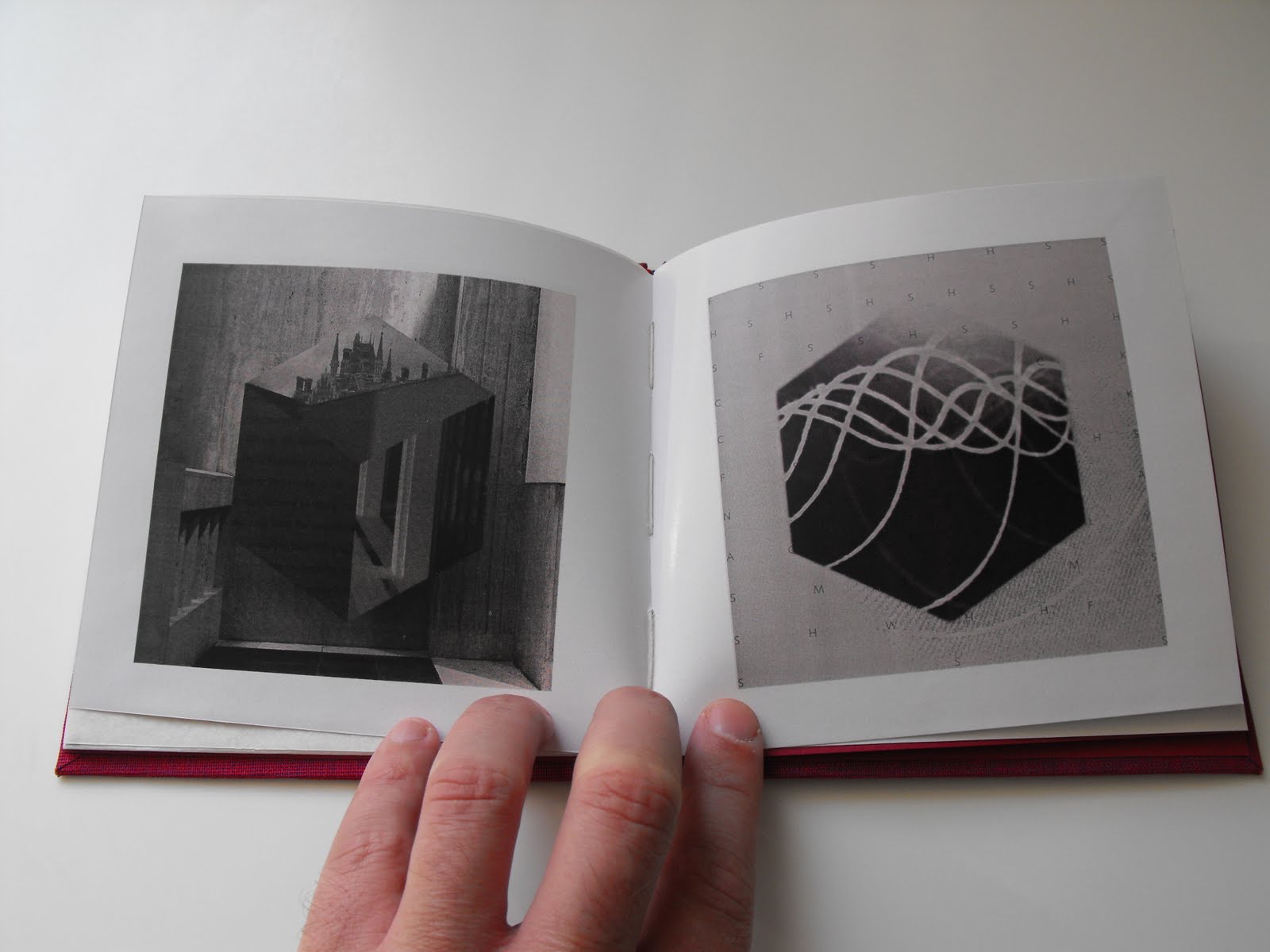
I've nearly finished the report for this project and for a while I have been talking about producing it in the format of a paperback book. So I just need to do a few more hours on it and then I can send it for printing. The above is the cover image which is based on the Marber Grid that was interesting me right at the beginning of the project. I've also used the Akzidenz Grotesk font for the title which relates to those vintage Penguin and Pelican paperbacks but the other text is using the British Library's favoured Syntax.
More recently I had become interested in the idea of noise from the perspective of it being very much about personal perception - despite wanting to produce something that felt like it was a very objective overview. One of the key things that was brought in of late was the visual disruption that can also come from resolution and - following the earlier method of printing material and re-scanning to lose some of its detail plus the use of the enlarged pixel - I've been producing images that combine different dpi outputs. This idea was also applied to the book cloth with the above shape being made up of the same piece being scanned at different sizes so that there's a contrast between the woven surfaces. I had also been manipulating the images during scanning to build on this idea of disruption within space so that crept in too. Plus there's the geometric forms that relate to my liking for textbook-type imagery.
Hoepfully this report element will be complete today and I can mainly focus on completing the CD packaging deliverable over the next fortnight.
02 May 2010

30 April 2010
SPARC inclusion

A while ago I sent an abstract relating to this Sshhh project for consideration within SPARC: the Salford Postgraduate Annual Research Conference. Today they got in touch to say that my request to be part of the poster section was successful. So I now need to consider how something will work within their programme. I'll have to devise a poster which uses images and text to outline my research. And do a short presentation in front of a judging panel. Which is great. But, y'know, it's another deadline.
And I have loads of deadlines.
That said, this is something I can concentrate on immediately after hand-in for the three current Masters modules and should help me formulate exactly what I'll be concentrating on delivering at the Bigger Than Words conference.
22 April 2010
Design Industry and Professional Practice assignment


Today I'm working on the essay for the Design Industry & Professional Practice module. It's actually my least favourite class. Possibly because it doesn't really suit my more typical way of working and also because it's very 'design management' influenced [and I can be a bit of a design management skeptic at times].
That said, I still need to turn in an assignment. I'm looking at the arguments for professional accreditation for the UK graphic design industry: a subject that has received more coverage of late due to a push by the Chartered Institute of Design. It also gathered a bit more momentum following the unwarranted criticism about the NHS 60 logo not long ago. Tomorrow we've got a tutorial to get some feedback on what we're doing, where we're up to, etc.
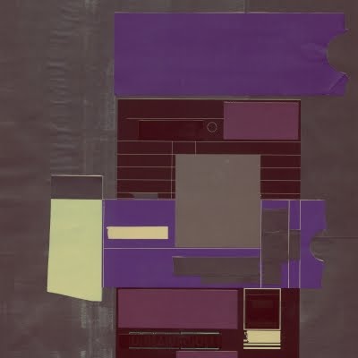
As a little diversion - and to try and develop some enthusiasm for the model we're following to prepare this report - I decided to spend a little bit of time thinking about a front cover for when it's finished. After messing around with some of the geometry that I'm using for the Negotiated Project module, I eventually did the above. It's supposed to be a graphic suggestion of how a fragmented industry may become united through accreditation. I liked incorporating some rough looking text for this one as recent projects have been a bit bolder type-wise. Plus it picks up on some of the little irregularities in the lining paper that it's printed on. Anyway... better get on with the essay itself now...
19 April 2010
The News

The latest news reports are really getting on my nerves. So much so that it has become distracting.
It's all this eruption disruption which - after five days of no flights due to all that volcanic ash floating around - has suddenly got people a bit too hysterical. ITV had reporters in various places giving 'the latest' as if it was breaking news on a major disaster. When it wasn't.
Some Brits were in France though. I've been to France. It's okay, actually. Unlike some parts of the world where you might find yourself under machine gun fire courtesy of child soldiers. That said, these countrymen of mine were waiting for a ferry.
Anyway it's the additional talk of "rescue" that I find most annoying. At the weekend there were suggestions of "Dunkirk Spirit" after some people with boats tried to get "our people" back from Europe. And I do understand that not being able to get home is really problematic for many. And my own sister has been upset because her school trip to Spain was cancelled. But I am right in saying that nobody has died, aren't I?
Still, to muck-in during what are evidently challenging times, I've knocked up a couple of postcard designs that can help us mark this momentous occasion. The one below is a "Keep Calm and Carry On" for all us survivors of 2010's Great Volcano Catastrophe.
Idiots.

18 April 2010
Independent's The New Review: The Design Issue


The New Review supplement that comes with the Independent was a design special today. It contains a lot of interesting material but, for me, it was the feature on book covers (coinciding with the Faber & Faber exhibition at the V&A) that immediately stood out. It includes some interesting perspectives from the people involved in making book covers about their way of approaching the task and the difficulties involved with distilling a very detailed story into one definitive image.
There's also a shopping page based around what you can purchase in museum and gallery gift shops. (That one is is online: www.independent.co.uk/life-style.)
Old vs New
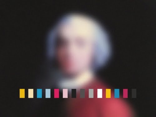


One thing that I've been considering is how to bring together the heritage that the British Library represents and more contemporary ideas. The building itself could already be perceived as not being sympathetic to the more historic aspects of the organization's activities, so I'm suggesting that I don't have to develop something that has some "sentimental" appreciation of the past. However, we discussed in the group tutorial a while back how this product would work for two audiences: one that holds the belief that it captures the essence of the British Library and one that sees it more as a design-led curiosity.
One decision I've made is to ensure that externally it doesn't feel like it leans too strongly one way or the other. I really like the book cloth when used with strong typography and feel that it presents a good, but simple, fusion of modern and traditional. So the intention is to bind the package (as a book) with the cloth with some basic information presented in a strong, graphic way. The text will adhere to the British Library's brand guidelines.
Internally I want it to be more challenging and blend a number of different elements: the sound visualizations, the documentation of the environment, the grids based on the axonometric views, copy relating to the organization, etc. The above referenced images are to help illustrate another suggestion: the coming together of the traditional elements with the contemporary. The idea is that this kind of suggestion of the historic alongside obvious digital age additions is more than just a way of highlighting a visual tension between disparate elements. It actually represents a shorthand for the way that the organization works and would also be defining a style that is supposed to work on a cheekier, irreverent level in addition to it also being able to suggest a weightier, respectful approximation when read by a different audience.
17 April 2010
Displacing text


I've been using the grid to see how text might appear if the shapes are used to displace parts of the letter forms. The experiments shift from the very small adjustment through to the kind of movement that pretty much obscures the original message. Elements of this might be interesting to incorporate alongside sections of the photographic documentation.


Layout idea

I've been experimenting with a few ideas to see how I might use any text alongside this axonometric view/triangular tessellation layout. What I think I'd like is some variation of scale and detail throughout the print aspect but with some aspects linking through the individual parts. So in some places it would be an obvious aspect of the design but much more subtle in others. The above demonstrates a more blatant use of the grid.
Grafik issue 185


The latest issue of Grafik is out and its devoted to the subject of music. There's a good feature on Manchester design agency Music, but the rest is mainly concerned with the importance of sound to visually literate creatives (i.e. not just designers).
I particularly like the 'Dataphonics' by Ryoji Ikeda (picture 4). There is also a really nice feature on Hyphen books. Anyway, I reckon that there's enough content relevant to my work to warrant the £9 price tag.
[By the way, Kick-Ass is great.]
13 April 2010
Axonometric views

The earlier experiment with the tessellated image got me thinking more about axonometric views. There's something brutally objective about them - probably owing to the fact that they don't try to seduce the eye with perspective. There's nothing to pull you into the image but instead they remain as two dimensional studies. Well... that's my current reading of them. So I'm thinking that this kind of format might suit this purpose. The angular nature of some of the photos - and the building itself - corresponds well. Subsequently this approach would ensure that the project's final outcome would intrinsically be linked to the architecture: again, forging that relationship between sound and the environment in which it exists. [They also relate to some of the views we have been using in 3D Max.]
This development would mean moving away from the circular forms [they would probably work for Manchester's Central Library] but I've already got ideas about how the sound shapes could be used in this more linear way. Plus it also presents the opportunity to keep the idea consistently running through text, images and layout through the use of a repeated parallelogram shape [itself made up of two equilateral triangles that additionally form a hexagon when repeated].
I think there's more than enough versatility/flexibility in this geometry to keep it interesting.
Mike Cina for Ghostly International


I mentioned Ghostly International in a previous post when noting the US label's issuing of the Terry Riley composition. The latest artwork was the work of Mike Cina who, alongside Will Calcutt, has been responsible for most of the sleeves in 2010. What he's produced this year is really inspiring. I mean, the label itself doesn't have a generic sound and each of these disparate recordings have been given an equally individual identity. But it's the approach to visualizing sound in a way that conveys a sensation that really works for me. The abstraction involved is a perfect way of creating a referent for this completely different art form: one that hints at the texture, timbre, pitch and tone of what the contents of each package might contain.
Creative Director Cina also has his own company with its portfolio at http://cargocollective.com/michaelcina. His clients have included Coke, Apple, Diesel, Hitachi, Pringles and more. He also founded http://www.youworkforthem.com/ - an excellent design resource.
Subscribe to:
Posts (Atom)


