30 April 2010

SPARC inclusion


A while ago I sent an abstract relating to this Sshhh project for consideration within SPARC: the Salford Postgraduate Annual Research Conference. Today they got in touch to say that my request to be part of the poster section was successful. So I now need to consider how something will work within their programme. I'll have to devise a poster which uses images and text to outline my research. And do a short presentation in front of a judging panel. Which is great. But, y'know, it's another deadline.

And I have loads of deadlines.

That said, this is something I can concentrate on immediately after hand-in for the three current Masters modules and should help me formulate exactly what I'll be concentrating on delivering at the Bigger Than Words conference.

Central Station creative social network


A friend suggested that I join the Central Station creative social network up in Glasgow. I'd already checked this site out earlier as they had a 'sound' month with lots of people working largely within the visual arts reponding to auditory influences. Anyway, I joined and got some feedback on a few bits of work that I uploaded. Yesterday I got a nice email to say that they wanted to put one of the images on the homepage. So there it is: bottom left under the 'Bulletin' text. I like those 13 sided polygons too, by the way.

28 April 2010

3D Max image


Just been playing around in 3D Max to see how some of these internal images might be made for a virtual environment.

27 April 2010

Cymatics experiment


I tried out some cymatics with the British Library audio using cornflour. The recordings themselves consisted of low level background noise with no extreme frequencies which might just explain why I ended up staring at a speaker containing a static white puddle for a while. So it didn't work with the tracks and the process hasn't generated any visualizations for the print project. Still, as I was set up, I thought that I should try it out using other sound. The rippled examples above were generated by the radio playing a Kanye West record. (The salt/vibration test didn't provide anything interesting either.)

CD track list


  1. 2' 03"
  2. 0' 44"
  3. 3' 11"
  4. 2' 30"
  5. 2' 31"
  6. 4' 03"
  7. 2' 11"
  8. 1' 31"
  9. 2' 25"
  10. 2' 45"
  11. 1' 22"
  12. 1' 07"
  13. 1' 34"
  14. 1' 46"


26 April 2010

Internal image suggestion with waveform


Just another potential internal image based on sound.

25 April 2010

Persistent Pyramids by Anatoly Zenkov


Further inspiration here with Anatoly Zenkov's angular disruption of space seriously adding a different dimension to his photography.

Sorted Books by Nina Katchadourian


A really nice project from Nina Katchadourian that arranges books to create new, readable messages/narratives through their titles.

As a sub-project of 'Special Collections', the idea was translated into an exhibition in the reading room of a library in California. I like this idea of reclassification. And even John Cage gets in there. Result.

Radius Installation by Random International

CC HH UK // Test video shot (unedited) from rAndom International on Vimeo.


"The installation is a sound-reactive media installation that plays with the light emitted by spatially arranged light sources. Where a commonly flat arrangement of LEDs would be conceived as a display with a resolution too low to establish image, text or pattern, Amplitude is actually home to a large number of individually controlled light sources on a y-axis. The introduction of a third dimension to the traditional concept of a display turns the piece into a vivid part of the space and emphasises the fact that the piece is a light installation rather than a display; the algorithm controlling the emittance of light creates a living organism that can be detected in the shadows that the installation casts on itself."

23 April 2010

Chris Cunningham show


I went to the Chris Cunningham show at the Opera House. Above is a previous A/V performance from him that appears to also contain most of the important elements I saw including the re-edited versions of 'Windowlicker', 'Sheena is a Parasite', 'Rubber Johnny' and 'Flex'.

I had an extra ticket which my sister ended up using and that proved interesting. She's not familiar with Cunningham's work but I thought that she wouldn't be too freaked out as she loves Spanish cinema - particularly inventive stuff by Guillermo del Toro and clever but terrifying horrors like Rec. However she felt this footage was a bit "weird". I must admit that I thought that it was a bit unsettling at times. Especially the more sexually explicit parts. And they were quite often "parts".

After leaving we both agreed that the precision editing - perfectly in time with the audio - was amazing. The super-fast cuts ensured that even the most frenetic soundtrack appeared to be generated by the image that was displayed on screen. Although some of these segments went on too long. Initially interesting, they were endlessly looped so that even someone like me (who loves their repetitive beats and hypnotic visuals) started losing interest before a particular section was finished.

My sister also said that the shocking, more pornographic material didn't feel edgy after being repeated so much. Which was probably true but really strange to hear her make that observation. Especially given that the next show she will be seeing is Dancing On Ice this Saturday.


Links to Chris Cunningham DVDs:

The Work Of Director Chris Cunningham [DVD]
Rubber Johnny - Chris Cunningham [DVD]


22 April 2010

Design Industry and Professional Practice assignment


Today I'm working on the essay for the Design Industry & Professional Practice module. It's actually my least favourite class. Possibly because it doesn't really suit my more typical way of working and also because it's very 'design management' influenced [and I can be a bit of a design management skeptic at times].

That said, I still need to turn in an assignment. I'm looking at the arguments for professional accreditation for the UK graphic design industry: a subject that has received more coverage of late due to a push by the Chartered Institute of Design. It also gathered a bit more momentum following the unwarranted criticism about the NHS 60 logo not long ago. Tomorrow we've got a tutorial to get some feedback on what we're doing, where we're up to, etc.

As a little diversion - and to try and develop some enthusiasm for the model we're following to prepare this report - I decided to spend a little bit of time thinking about a front cover for when it's finished. After messing around with some of the geometry that I'm using for the Negotiated Project module, I eventually did the above. It's supposed to be a graphic suggestion of how a fragmented industry may become united through accreditation. I liked incorporating some rough looking text for this one as recent projects have been a bit bolder type-wise. Plus it picks up on some of the little irregularities in the lining paper that it's printed on. Anyway... better get on with the essay itself now...

Another proposed internal image


Above is a continuation of the idea of visually disrupting an image of the space to convey a suggestion of how noise exists there. Again, this is using the same angular grid pattern. (I'm quite liking the line of the applied geometry following that of the escalator.)

I'm also currently favouring the idea of not using any images of either people or books within this. I think that the images then become about an overview of a space and possibly have the objectivity that I mentioned when discussing my thoughts on axonometric views. I also believe that the lack of visitors within the illustrations makes them an ideal accompaniment to the CD: at least with regards to the sounds that fill these voids having no definition as to their root cause. The way I see it, this should then leave it open to interpretation and require more personal investment by the viewer/listener.

21 April 2010

Penguin 1980s covers by John Squire


From Creative Review via Dave:


Penguin launched its Decades series this month, with five titles each representing the best novels of the 1950s, 60s, 70s, and 80s. We really liked the covers for the 1980s series, designed by a man perhaps more known for his art (and the Stone Roses): John Squire...

The plans for the series were announced earlier this year (and covered in Design Week) and are part of Penguin's 75th anniversary celebrations. But we thought Squire's efforts, which hit the shops this month, were so nice that they warranted a post. Squire created a series of paintings for the covers under the direction of Penguin's Jim Stoddart.

You can view the rest of the covers for classics from the 1950s, 60s, and 70s, here. They were created by Peter Blake (50s), Allen Jones (60s), and Zandra Rhodes (70s) under the art direction of John Hamilton at Penguin.


Available via the following links:

Hawksmoor (Penguin Decades)
An Ice-cream War (Penguin Decades)
Latecomers (Penguin Decades)


3D Studio Max animation


Above is some geometry being plain mental in 3d Max. The textures on the objects are from the image on the earlier post. I'm currently looking at ways to use the morphing tool to give another aspect to the sort of ominous shapes that I'm placing in the British Library as visualizations of noise.

20 April 2010

Proposed internal image


Another visual idea for the inside of this book. This one uses aspects of the grid that was previously mentioned alongside some photography of the space.

I made some notes the other day and mentioned something about how visual disruption within depictions of the environment could be a metaphor for the noise that exists there. The above was an attempt to illustrate that idea although, for me, there's something a bit disturbing about the image.

Visitor map


This is really a post of interest to Amy as it relates to her current work. Only, as unlikely as it sounds, other people have actually been reading this blog.

I installed a stat counter (just out of interest) and it monitored some viewers located on the above map. It also lists keywords/searches that brought them here and it seems that the mentions of "Ryoji Ikeda" and "Terry Riley" were of particular interest.

Now what would happen if I were to say "Cheryl Cole"?

19 April 2010

Views


Bigger Than Words programme


There has been a rough draft of the programme for the Bigger Than Words conference drifting around. My contribution is pencilled in under a section titled 'Noise, Politics and Everday Life'. The other two submissions within this grouping appear to be music-related and I'm assuming that my subject very much represents the 'Everyday Life' within that title. Only I'm not sure that what I'm looking at is really that political. (Unfortunately it will clash with another session based around audiovisual noise aesthetics which I'd liked to have checked out.)

I do still need details through on the venue so that I can think through exactly what I'll be completing. I think my stint takes place on the afternoon of July 2nd but I had mentioned to both Dave and Amy about doing something as an installation to run for the duration of the event.

[The above is one of the internal images I've been playing around with, by the way.]

The News


The latest news reports are really getting on my nerves. So much so that it has become distracting.

It's all this eruption disruption which - after five days of no flights due to all that volcanic ash floating around - has suddenly got people a bit too hysterical. ITV had reporters in various places giving 'the latest' as if it was breaking news on a major disaster. When it wasn't.

Some Brits were in France though. I've been to France. It's okay, actually. Unlike some parts of the world where you might find yourself under machine gun fire courtesy of child soldiers. That said, these countrymen of mine were waiting for a ferry.

Anyway it's the additional talk of "rescue" that I find most annoying. At the weekend there were suggestions of "Dunkirk Spirit" after some people with boats tried to get "our people" back from Europe. And I do understand that not being able to get home is really problematic for many. And my own sister has been upset because her school trip to Spain was cancelled. But I am right in saying that nobody has died, aren't I?

Still, to muck-in during what are evidently challenging times, I've knocked up a couple of postcard designs that can help us mark this momentous occasion. The one below is a "Keep Calm and Carry On" for all us survivors of 2010's Great Volcano Catastrophe.

Idiots.


18 April 2010

Independent's The New Review: The Design Issue


The New Review supplement that comes with the Independent was a design special today. It contains a lot of interesting material but, for me, it was the feature on book covers (coinciding with the Faber & Faber exhibition at the V&A) that immediately stood out. It includes some interesting perspectives from the people involved in making book covers about their way of approaching the task and the difficulties involved with distilling a very detailed story into one definitive image.

There's also a shopping page based around what you can purchase in museum and gallery gift shops. (That one is is online: www.independent.co.uk/life-style.)

Old vs New


One thing that I've been considering is how to bring together the heritage that the British Library represents and more contemporary ideas. The building itself could already be perceived as not being sympathetic to the more historic aspects of the organization's activities, so I'm suggesting that I don't have to develop something that has some "sentimental" appreciation of the past. However, we discussed in the group tutorial a while back how this product would work for two audiences: one that holds the belief that it captures the essence of the British Library and one that sees it more as a design-led curiosity.

One decision I've made is to ensure that externally it doesn't feel like it leans too strongly one way or the other. I really like the book cloth when used with strong typography and feel that it presents a good, but simple, fusion of modern and traditional. So the intention is to bind the package (as a book) with the cloth with some basic information presented in a strong, graphic way. The text will adhere to the British Library's brand guidelines.

Internally I want it to be more challenging and blend a number of different elements: the sound visualizations, the documentation of the environment, the grids based on the axonometric views, copy relating to the organization, etc. The above referenced images are to help illustrate another suggestion: the coming together of the traditional elements with the contemporary. The idea is that this kind of suggestion of the historic alongside obvious digital age additions is more than just a way of highlighting a visual tension between disparate elements. It actually represents a shorthand for the way that the organization works and would also be defining a style that is supposed to work on a cheekier, irreverent level in addition to it also being able to suggest a weightier, respectful approximation when read by a different audience.

17 April 2010

Displacing text


I've been using the grid to see how text might appear if the shapes are used to displace parts of the letter forms. The experiments shift from the very small adjustment through to the kind of movement that pretty much obscures the original message. Elements of this might be interesting to incorporate alongside sections of the photographic documentation.


Layout idea


I've been experimenting with a few ideas to see how I might use any text alongside this axonometric view/triangular tessellation layout. What I think I'd like is some variation of scale and detail throughout the print aspect but with some aspects linking through the individual parts. So in some places it would be an obvious aspect of the design but much more subtle in others. The above demonstrates a more blatant use of the grid.

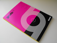
Grafik issue 185


The latest issue of Grafik is out and its devoted to the subject of music. There's a good feature on Manchester design agency Music, but the rest is mainly concerned with the importance of sound to visually literate creatives (i.e. not just designers).

I particularly like the 'Dataphonics' by Ryoji Ikeda (picture 4). There is also a really nice feature on Hyphen books. Anyway, I reckon that there's enough content relevant to my work to warrant the £9 price tag.

[By the way, Kick-Ass is great.]

Archive

Contributors

Followers