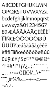
According to the British Library's brand guidelines, the typeface that should be used at all times - across all forms of external and internal communication - is Syntax*. Here's what the (sometimes unreliable) Wikipedia has to say about it at http://en.wikipedia.org/wiki/Syntax_%28typeface%29:
Syntax is a humanist sans-serif typeface designed by the Swiss typeface designer Hans Eduard Meier (born 1922) in 1968, and released in 1969 by the D. Stempel Schriftgießerei (type foundry) of Frankfurt am Main. It is believed to be the final face designed and released by D. Stempel for foundry casting.
The original drawings were done in 1954; first by writing the letters with a brush, then redrawing their essential linear forms, and finally adding balanced amounts of weight to the skeletons to produce optically monoline letterforms. In the period 1968–1972, Meier worked on additional weights and variations to the Syntax typeface. In 1989, the original foundry metal design was digitized by Adobe, which also expanded the family to include bold and ultrabold weights, resulting in a family family of 4 romans and 1 italic (in lightest weight) fonts.
Meier described Syntax as being a sans-serif face modeled on the Renaissance serif typeface, similar to Bembo. The uppercase has a wide proportion, and the terminals not being parallel to the baseline provide a sense of animation. The lowercase a and g follow the old style model of having two storeys. The italics are a combination of humanist italic forms, seen in the lowercase italic q, and realist obliques, seen in the lowercase italic a, which retains two storeys, unlike in other humanist sans-serif typefaces like FF Scala Sans and Gill Sans, where the a has a single storey italic.
*There is an additional note on the brand guidelines that Arial may be used where Syntax is unavailable.


No comments:
Post a Comment